
AES' visual identity guidelines
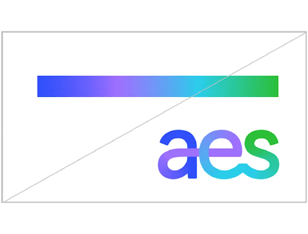
Gradient line
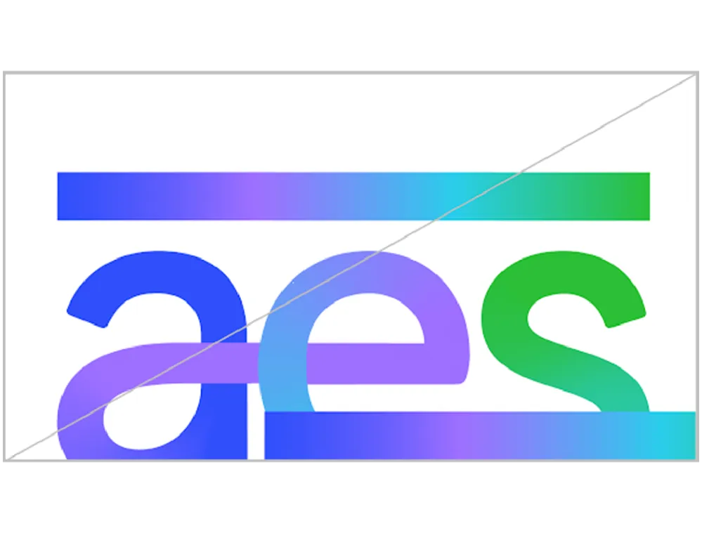
Our gradient line is the foundational element of our visual identity. Forming our logo, it represents our unique ability to respond to our customers’ needs and to tailor our solutions around them. The transition to green reflects the connection between our history and our future, and the shape functions as a literal connection that brings together all of our visual elements in the system.

Line story
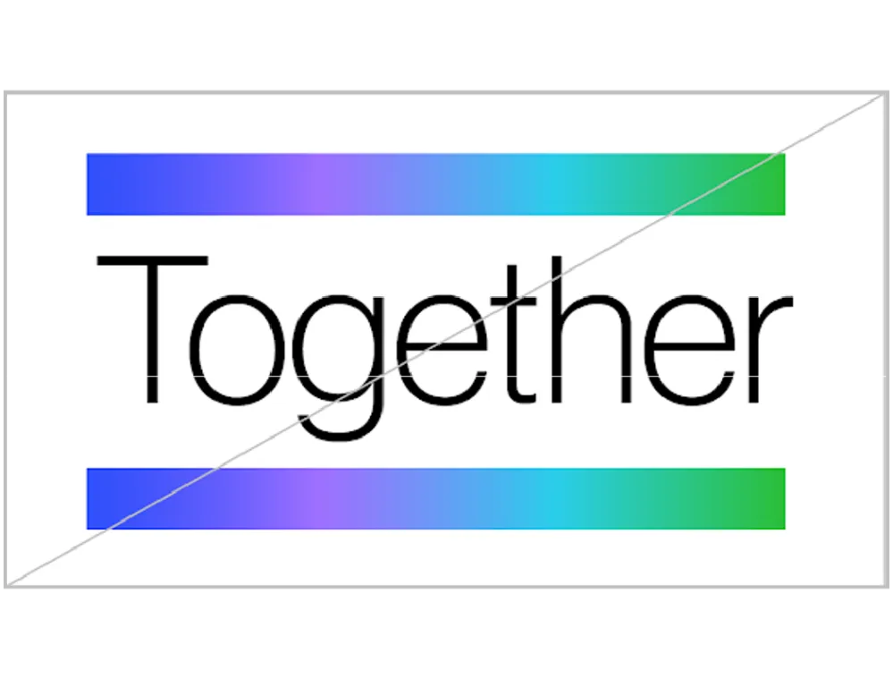
Combined into a line element, color signals how we work together towards a greener, smarter future of energy.

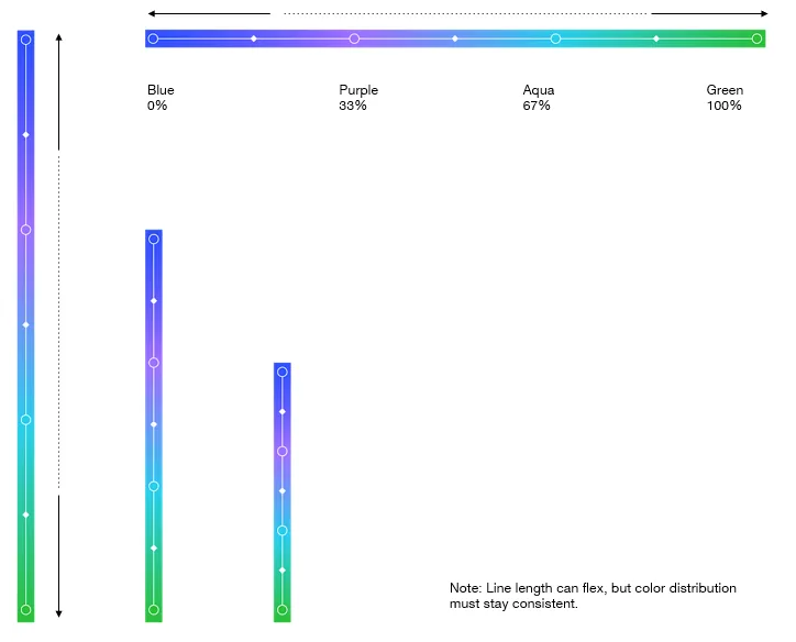
Color
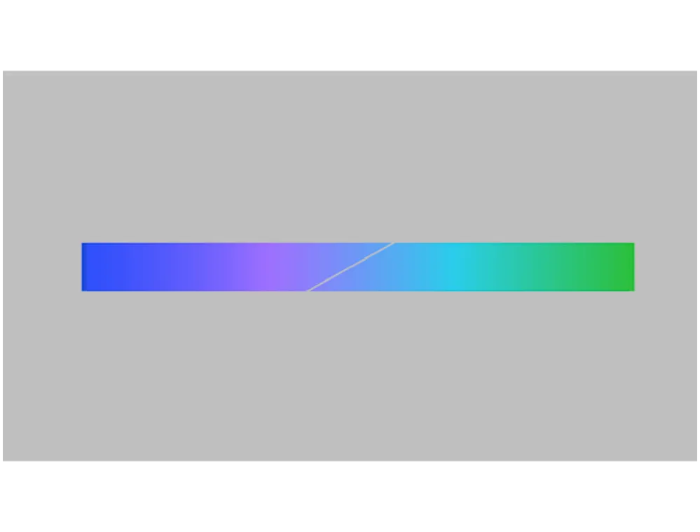
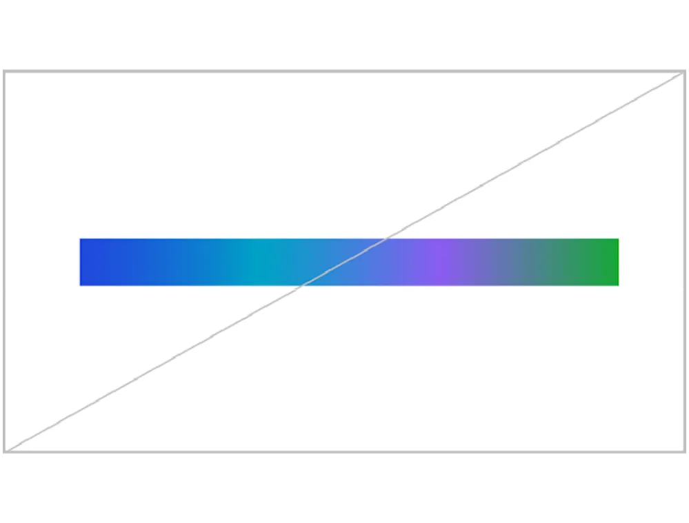
The gradient colors should be plotted evenly along the stroke in the following order:
➔ AES Gradient Blue
➔ AES Gradient Purple
➔ AES Gradient Aqua
➔ AES Gradient Green
Whether used horizontally or vertically, the first color should be blue. The percentage values shown, right, indicate the color positions along the gradient, while the white diamonds represent the correct (and automatic) gradient slider position.
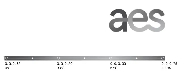
Monochrome
In special—single color—use cases, a monochrome line can be used. The colors are plotted evenly along the line and is comprised of the following color values:
➔ 0, 0, 0, 85
➔ 0, 0, 0, 50
➔ 0, 0, 0, 30
➔ 0, 0, 0, 75
The percentage values shown, right, indicate the color stops along the gradient, while the white diamonds represent the correct (and automatic) gradient slider position.
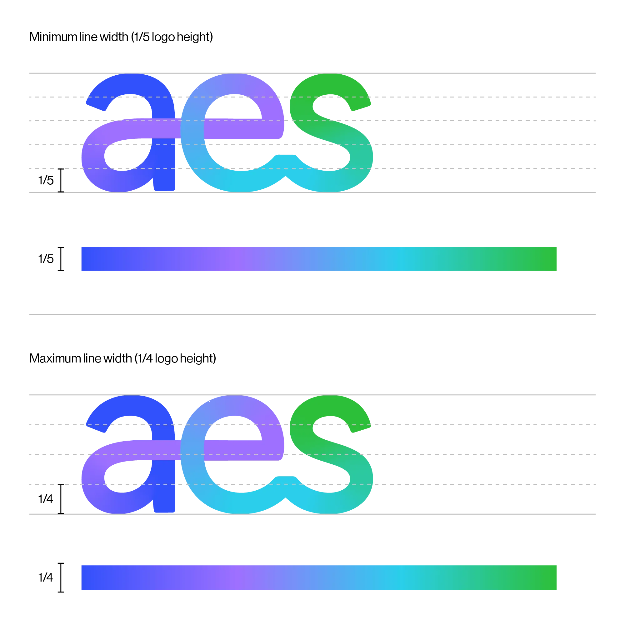
Width
The line weight is defined by the size of the AES logo. It should be between a fifth and a quarter the height of logo, and look to optically match the logo line weight.
When designing larger compositions or when using the smallest logo option, the larger (¼) size line weight may be preferable. A smaller line might not have enough impact. Comparatively, in smaller compositions or when using the largest logo option, the smaller (⅕) size line width may allow for a simpler, less crowded layout.
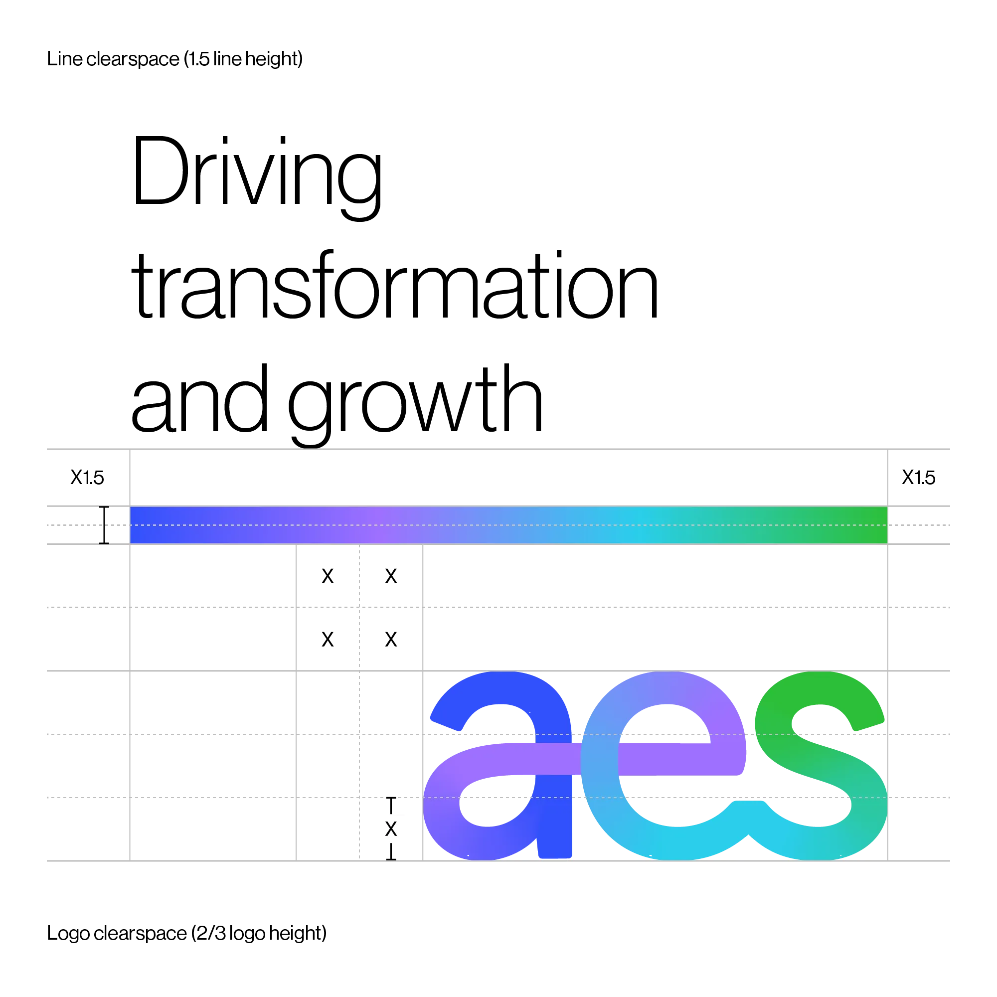
Clearspace
Images can be placed adjacent to lines. However, all other elements should adhere to clearspace around the line.
Our logo should never be positioned closer to the line than the logo clearspace allows (two thirds of logo height). Refer to logo ‘clearspace’ page for guidance on logo clearspace.
Text should be no closer to the line than line clearspace allows (shown right).
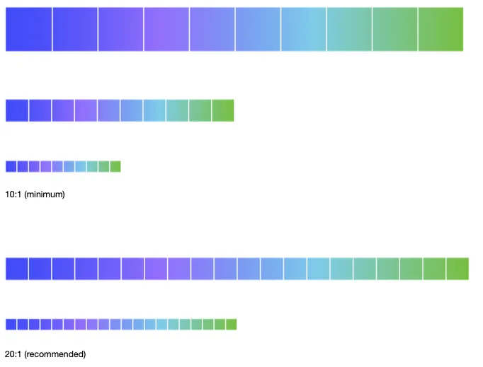
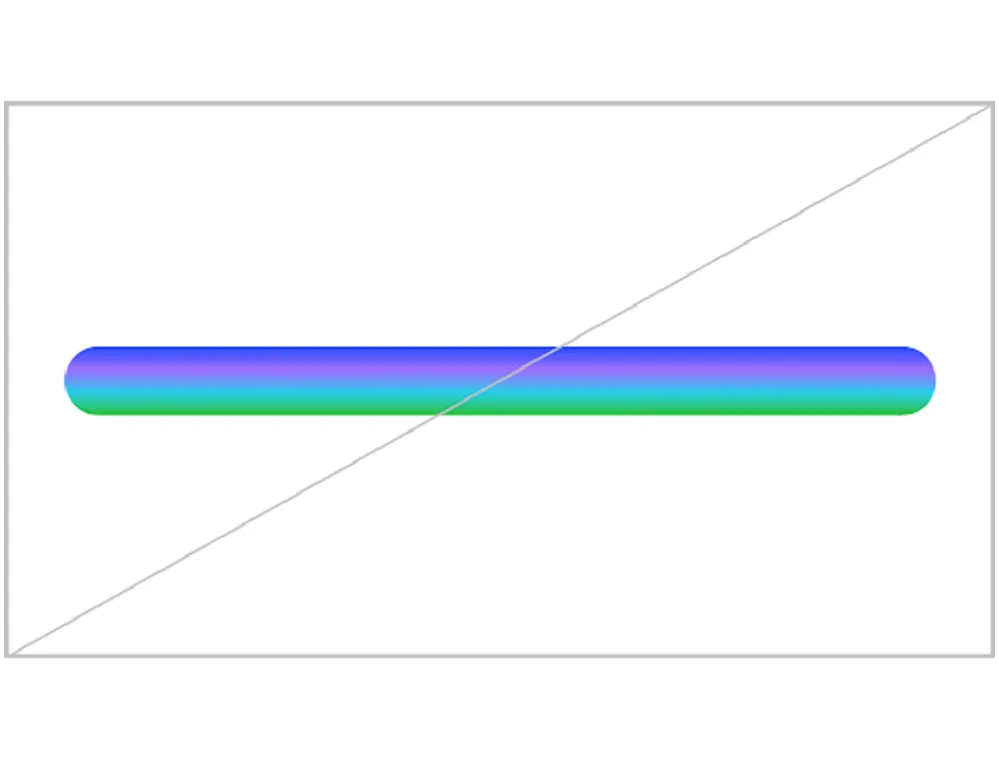
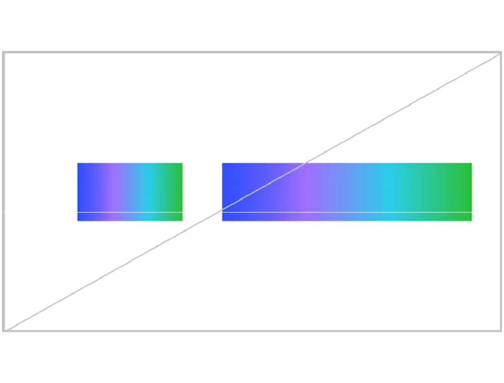
Ratio
The relationship between the length and line width should never be less than a ratio of 10:1.
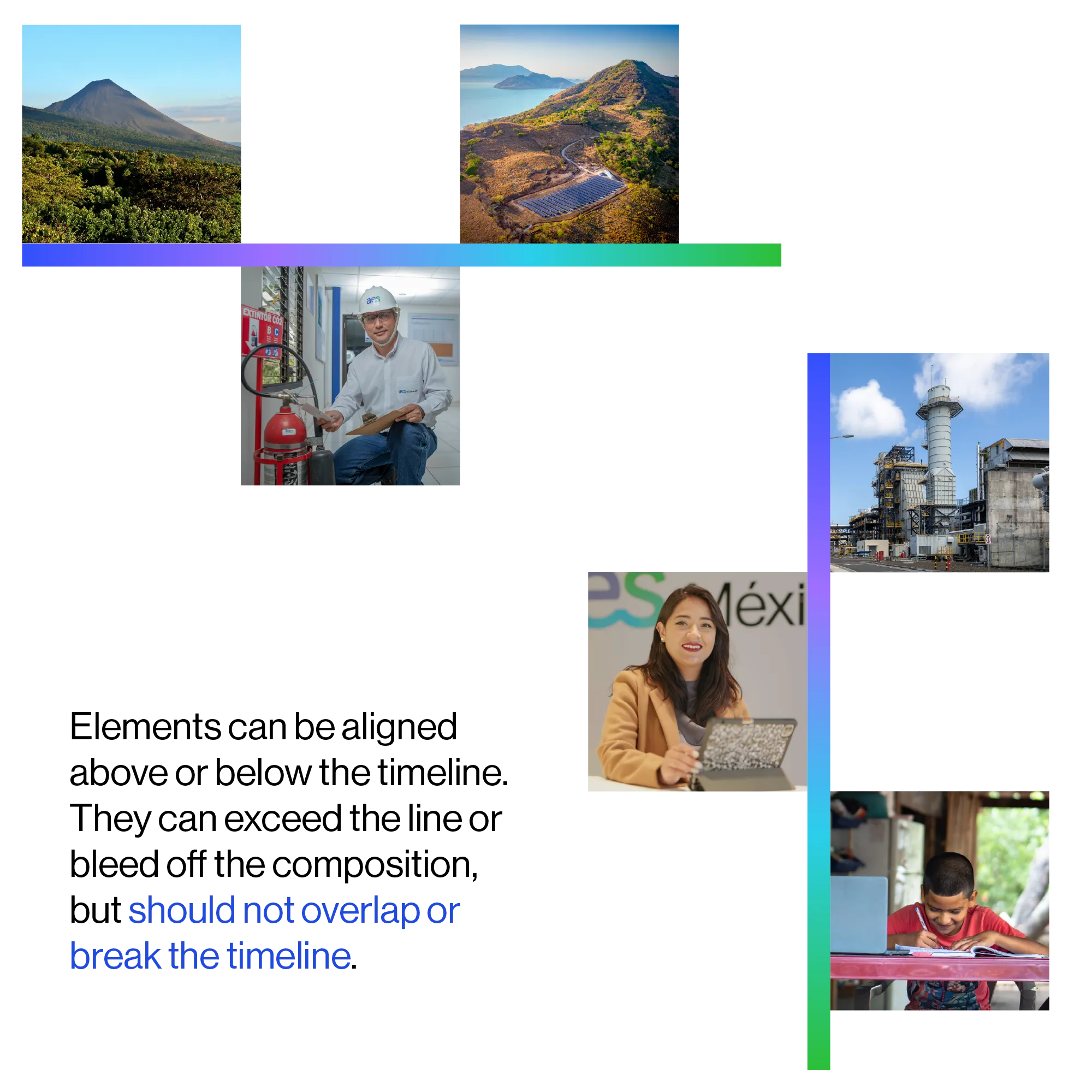
Timeline
By using our line as a signifier of change, we can create flexible timelines. These timelines can be standalone structural elements or connected with other text or photographic elements to create more expressive layouts.
The line can be implemented as a horizontal or vertical timeline.
Note: The line must always be shown with a butt (flat) cap and rounded joints.
Structural
The line as a structural element should be used minimally and thoughtfully. It should not be used purely for decoration.
In structural situations, the line can be broken.
Note: When using a structural line in close proximity to the AES logo, look to match line weight. See “line width” for guidance. The line should not be closer to the logo than the logo clearspace allows. Refer to “clearspace” for guidance.
Incorrect usage
The gradient should always follow the line. The line should always have a butt cap and rounded joints.
Do not place line too close to—or overlap with—other brand elements.
Do not use line on Gray 02 or Gray 03 backgrounds.
Do not bend or shape line.
Lines should be used thoughtfully and sparingly. Refer to ‘color proportions’ page.
The line should be between a quarter and fifth the height of the logo. Ensure sufficient clearspace (two third height of logo) between line and logo.
Line gradient should always read: AES Blue, AES Purple, AES Aqua, AES Green. Do not use non-brand colors.
Line length to width ratio should never be less than 10:1.
