
AES' visual identity guidelines
Color
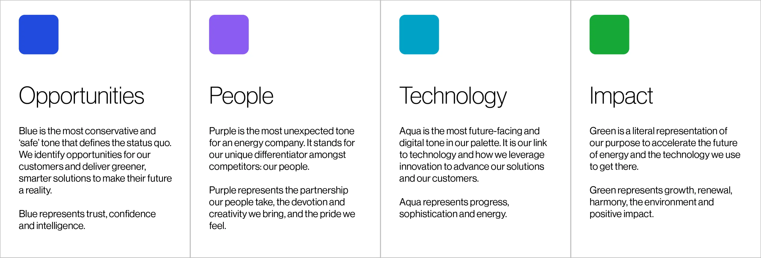
Our colors tell the story of how we do our work and why we do it and represent the different elements that build our brand and offering.

Color story
Our colors tell the story of how we do our work and why we do it...

… and represent the different elements that build our brand and offering.
They combine to create our gradient line, present in our logo and throughout our brand.

AES' Signature colors
Our signature colors are the center of our written visual identity. They are used for hero moments to highlight messaging as well as for infographics.
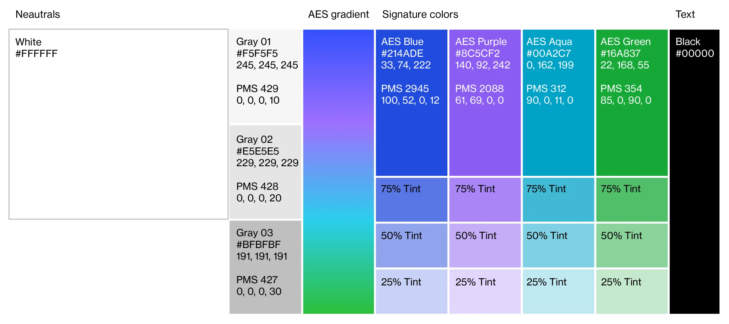
Neutrals
Our neutrals are the most used colors within our palette. The majority of our composition backgrounds are white. While some have gray sections to highlight aspects of the composition, the majority remain white.
Neutrals can also be used to supplement infographic palettes.
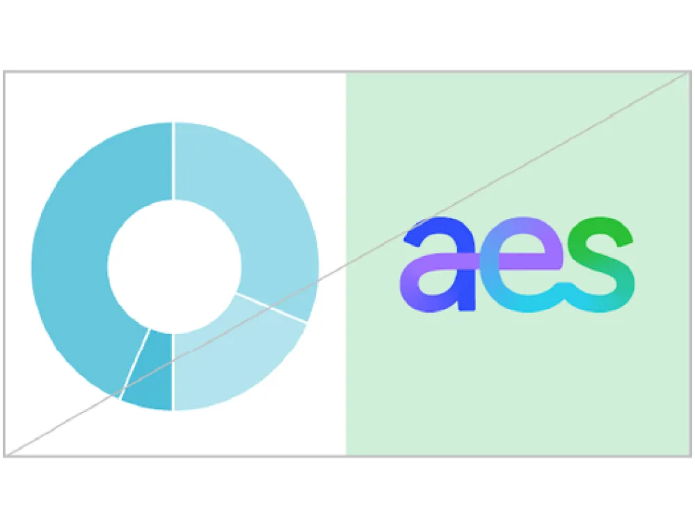
Color Proportions
In order to implement the new visual identity successfully, color needs to be used in the right proportions.
Our AES gradient and signature colors can easily overpower communication materials if not handled carefully.
Compositions should remain light and effortless. We recommend starting with a white background before adding an element featuring the AES gradient or signature colors.

Incorrect usage
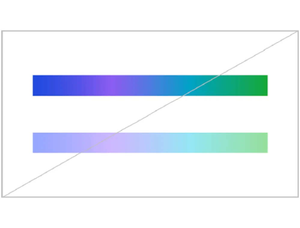
Only use gradient swatches for gradients.
Use AES signature color tints of 25%, 50% and 75%. Do not use for brand hero moments.
Do not add special effects to, or use off-brand colors.

Do not use AES gradients on signature colors or signature colors for backgrounds in hero moments.
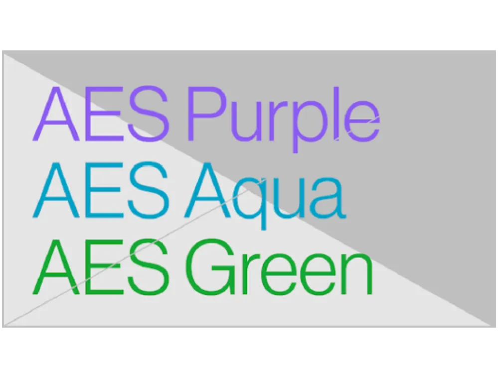
Do not use AES Purple, AES Aqua and AES Green colored text on gray backgrounds.

Do not use black for backgrounds. Only use black for text.

Do not use too much color on a page. Compositions should be light and effortless.

Do not use purple, aqua or green text at sizes below 18pt.
