
AES' visual identity guidelines
Logo
Our logo is our visual symbol and represents the essence of what we stand for as a brand. It is our unique signature and is used as a sign-off on the majority of applications and touchpoints.

Primary
The primary logo (which uses the AES gradient) should be used across all applications. However, our AES logo may not be suitable in all print use cases. In scenarios which require only one color, we can use our additional optimized logos.
Primary: for all digital applications and print where possible. It is always preferred to use the full-color version of the logo. If an application requires a single color logo, default to the secondary (monochrome gradient) version.
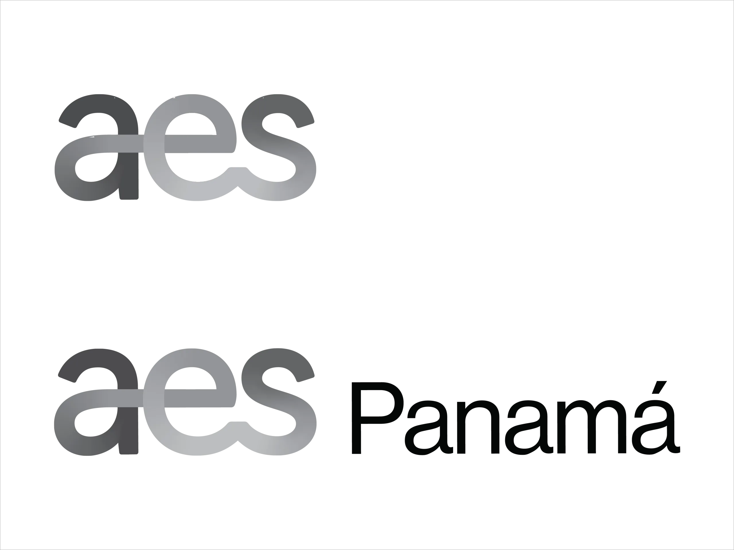
Secondary
The secondary (monochrome gradient) version may be more suitable for faxing and single color print advertisements.
The secondary logo is comprised of the following color values:
➔ 0, 0, 0, 85
➔ 0, 0, 0, 50
➔ 0, 0, 0, 30
➔ 0, 0, 0, 75
Secondary: for print uses where limitations apply
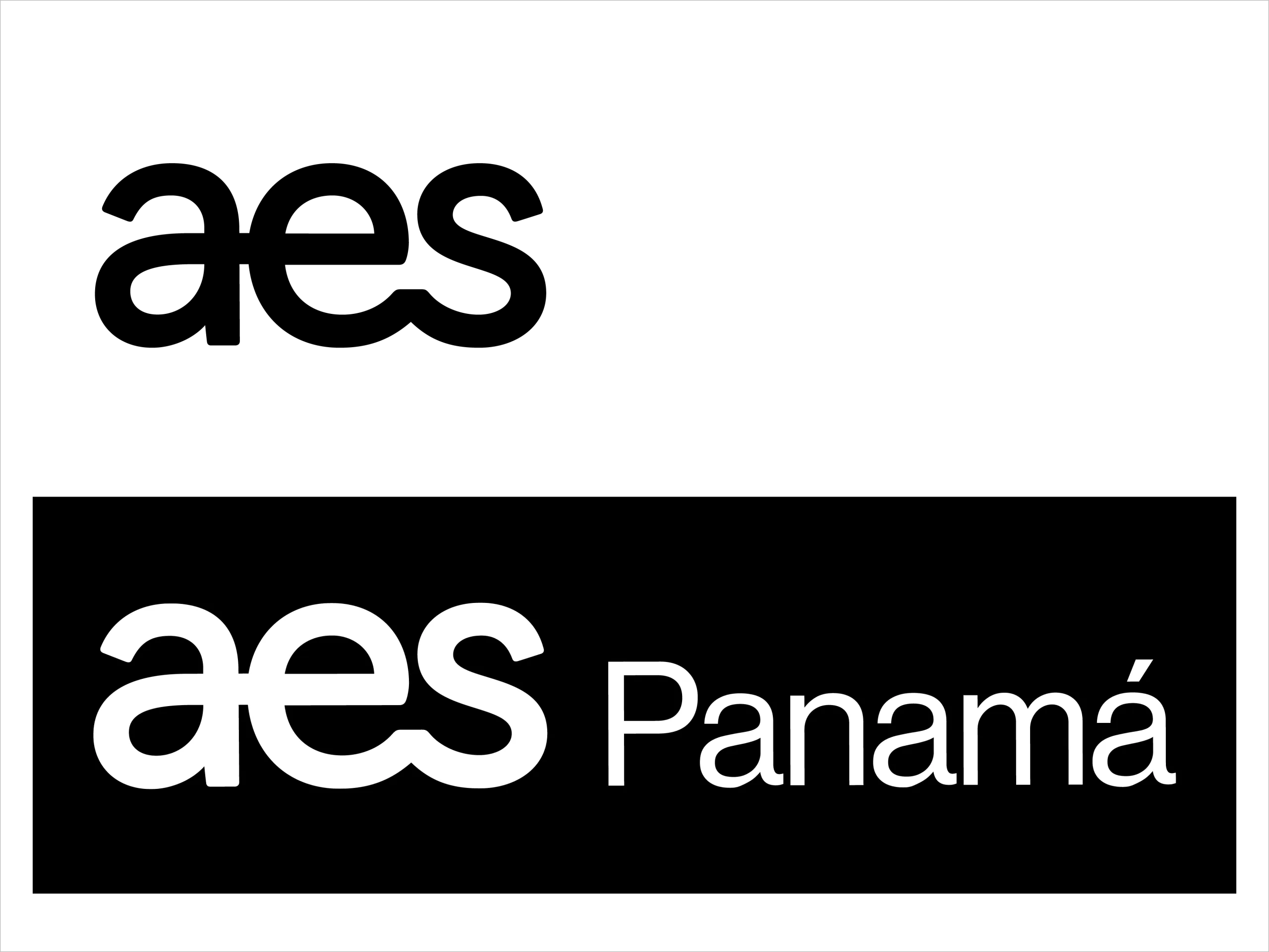
Tertiary
The tertiary versions (in black and white) may be more suitable for embossing, low-quality print advertisements and other printing effects. They can also be used in sponsorship situations in which the primary logo would not perform.
Tertiary: for print uses where limitations apply. The tertiary version should be used sparingly, only in situations where the secondary (monochrome gradient) version cannot be applied in a specific one-color logo use case.
In-use
The primary logo (which uses the AES gradient) should be used across all applications. However, our AES logo may not be suitable in all print use cases. In scenarios which require only one color, we can use our additional optimized logos.
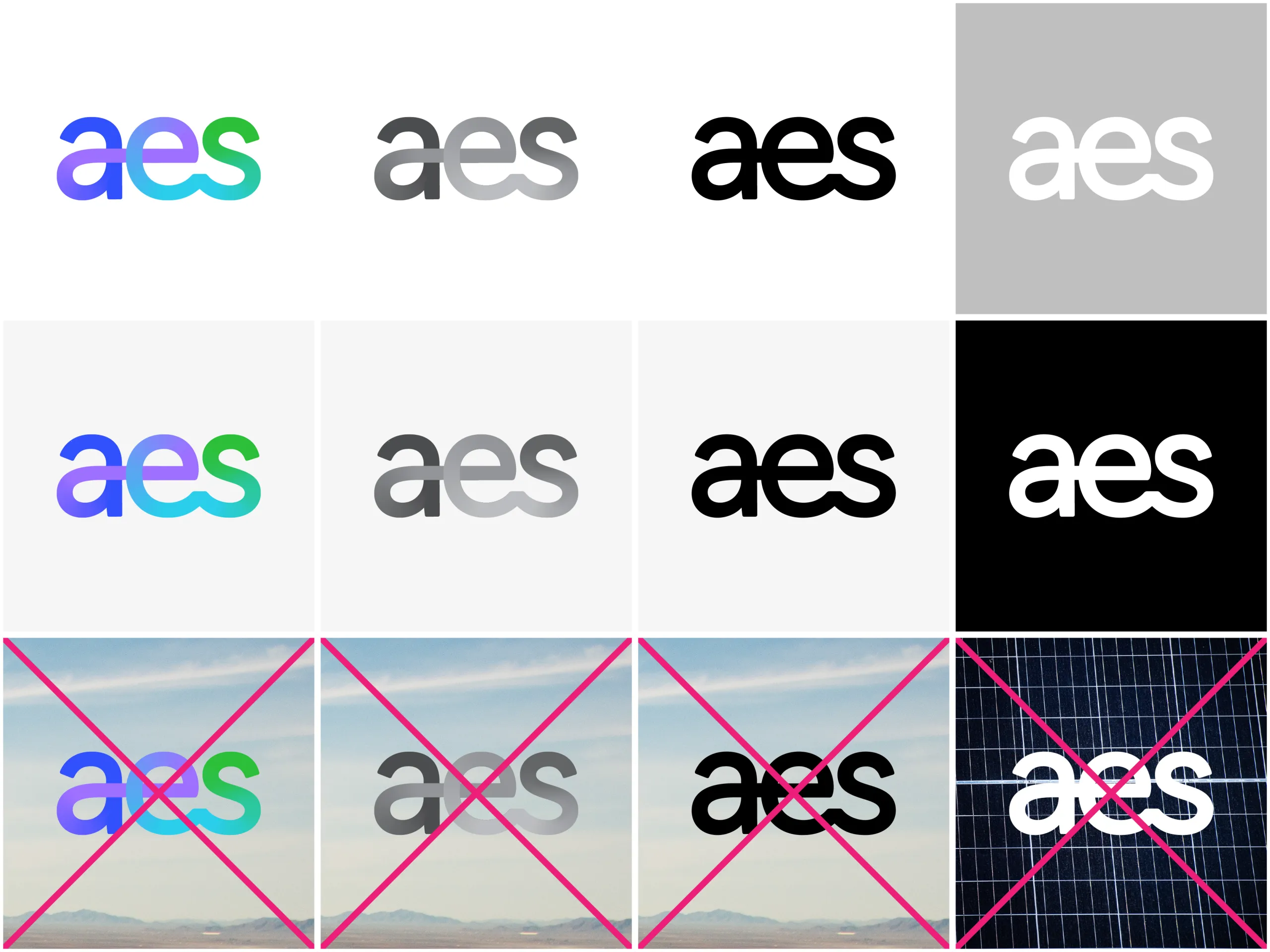
TIP: It is preferred that the AES logos be placed on a white background. Placing the logos on a Grey 01 background is also acceptable. Avoid placing the AES logo on top of an image.
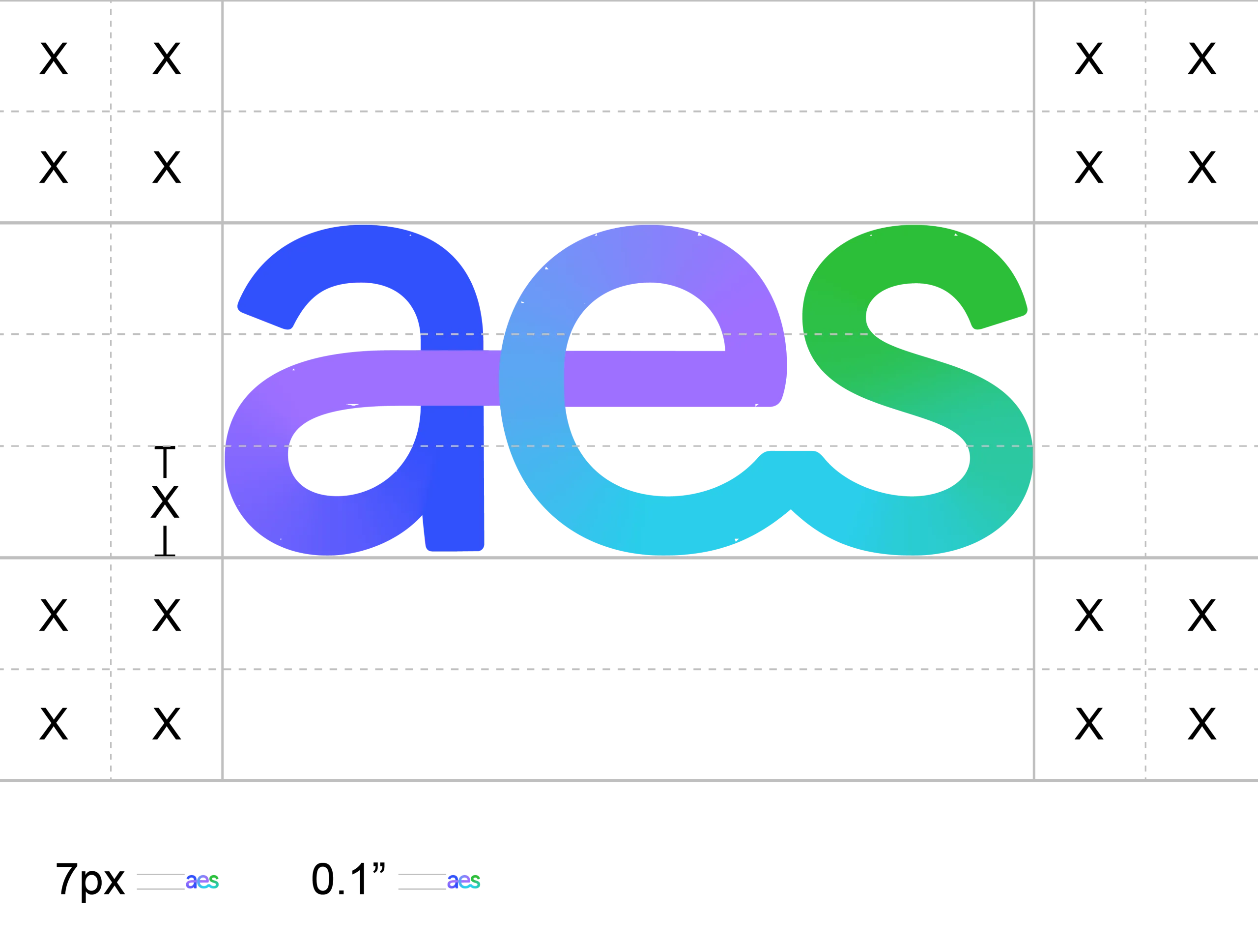
Clearspace and minimum size
Clearspace is the minimum distance between the logo and other visual and verbal elements. The height of the AES logo defines the clearspace.
The minimum recommended size of the logo is 0.1” for print and 7px for screen.
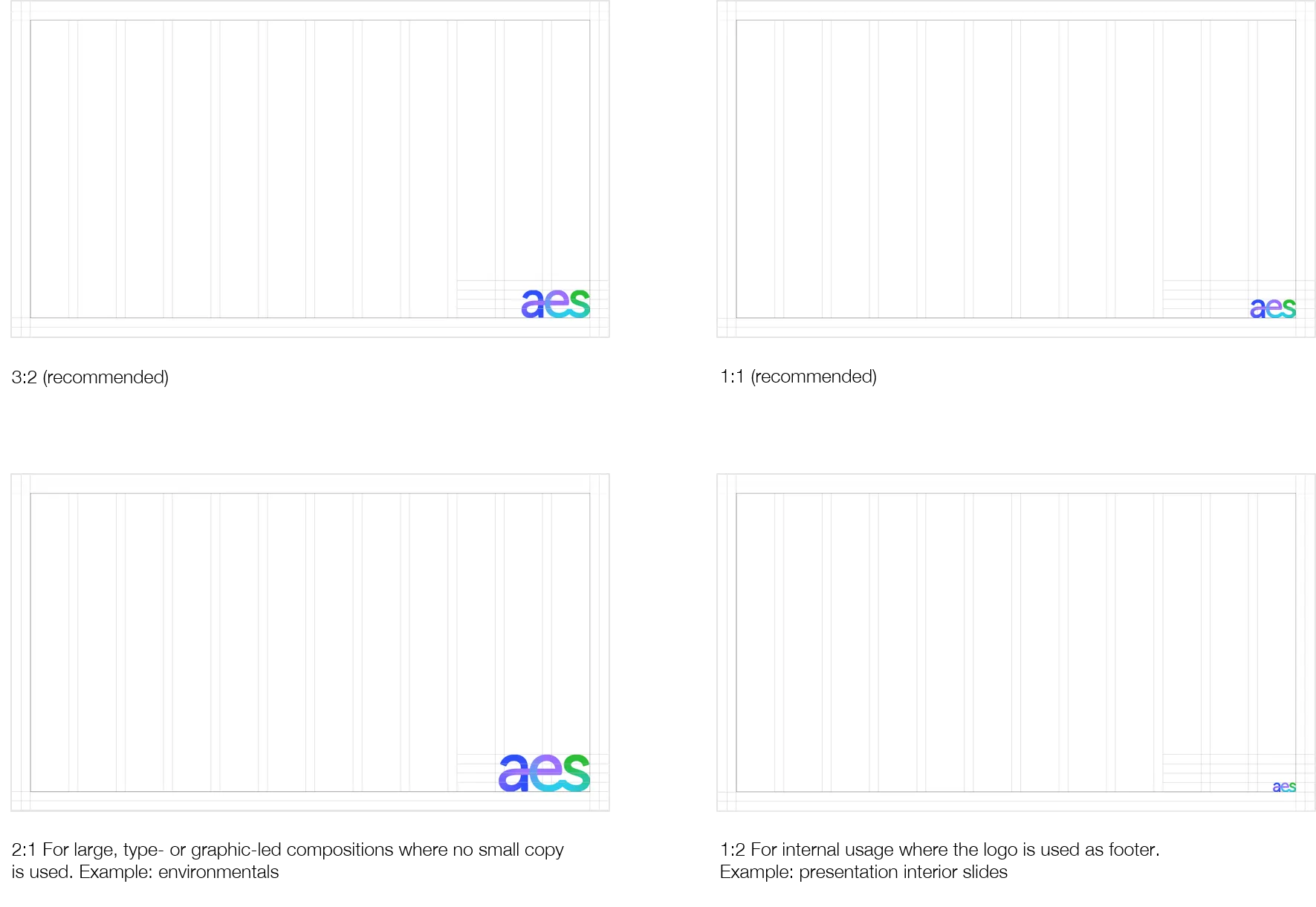
Logo placement
The AES logo should be placed at the bottom right of compositions where possible. In situations where scrolls are involved, the logo should be placed top left to ensure the logo can be seen at all times.
Depending on the scale and purpose of the composition, the AES logo will need to differ in size. Primarily, the logo should be scaled to a ratio of 3:2, whereby the margin is two thirds the height of the logo. In occasions where this feels like it’s too large, the logo can be reduced to a ratio of 1:1 where the margin is the same height as the logo.
Note: The AES logo should be placed at the bottom right of the composition where possible. In situations where scrolls are involved, the logo should be placed top left to ensure the logo can be see at all times.
Logo in motion
Linear
In motion, the AES logo can be drawn in a single line. This motion behavior reflects the handwritten, human element of the static form. It should be used in more formal situations, such as end cards and the final slide of a presentation.
Line flex
This motion behavior is tied to other components of the AES identity. The transition from logo to line is a regular feature in the system. The line represents a timeline and denotes the AES’ purpose to work towards the future. It should be used for expressive, light-hearted moments, such as social media and when transitioning between gestures.

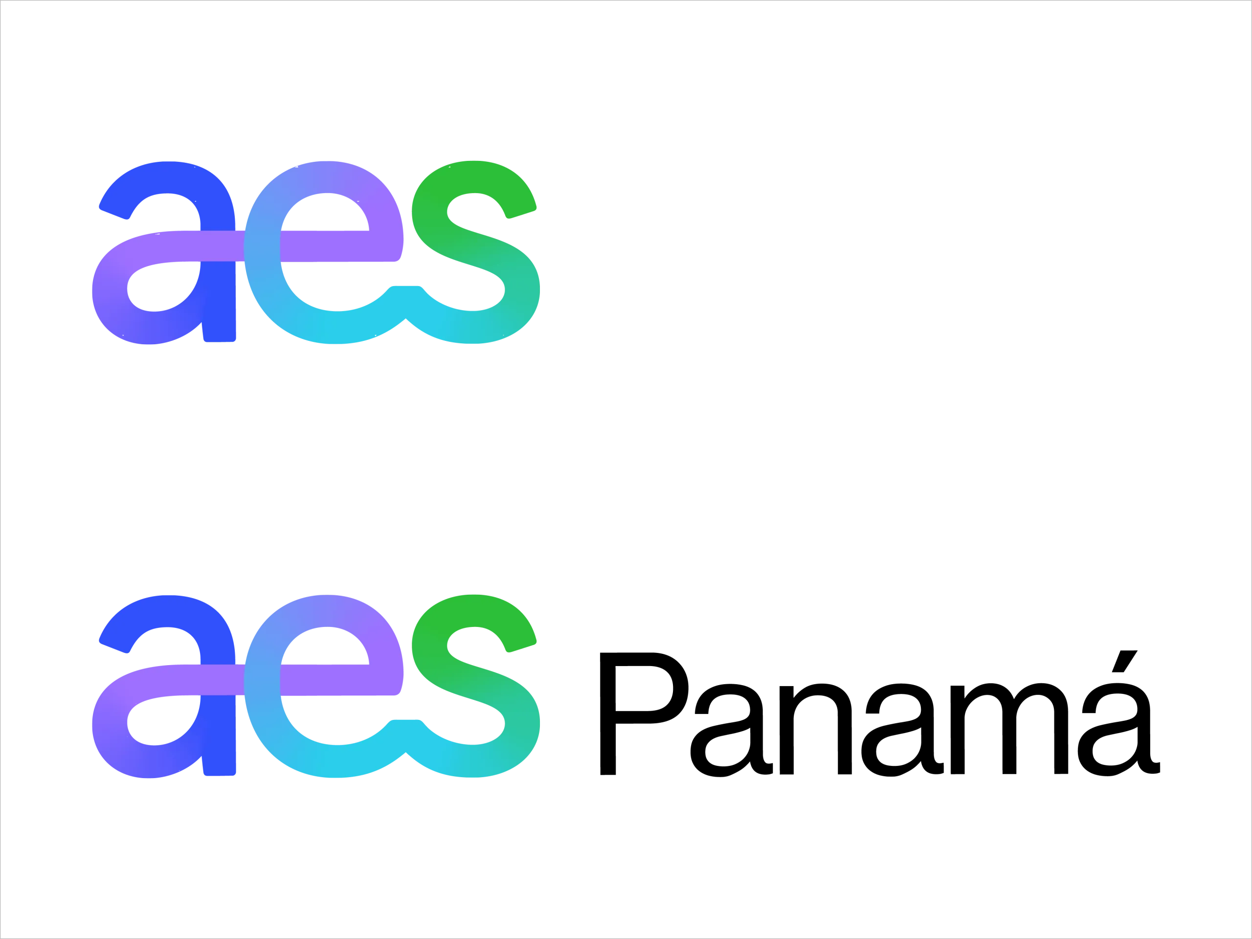
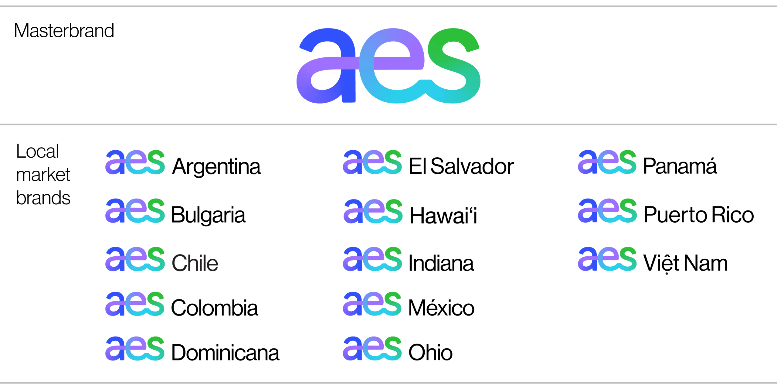
Market Lock-up
AES’ brands are organized using a masterbrand model. The AES masterbrand extends across a selection of local markets to indicate AES’ local expertise and impact in the regions, as well as a selection of capabilities that include everything AES has to offer.
Our market brands each have a unique lock-up that includes the masterbrand logo and the market’s name in local-language spelling.
All market logos are available in our brand asset library. We cannot create any other logos or lockups with the AES logo.
Incorrect usage
Do not alter gradient
Do not alter spacing between 'A', 'E', 'S'.
Do not recolor or create outlined versions of the logo.
Only use alternate versions of logo where primary logo cannot be used.
Use logo on white, Gray 01 (and light photography when unavoidable) backgrounds.
Don’t add effects or rotate logo.
Ensure sufficient clearspace.
Do not adjust spacing between market lock-up elements.
