
AES' visual identity guidelines
Iconography
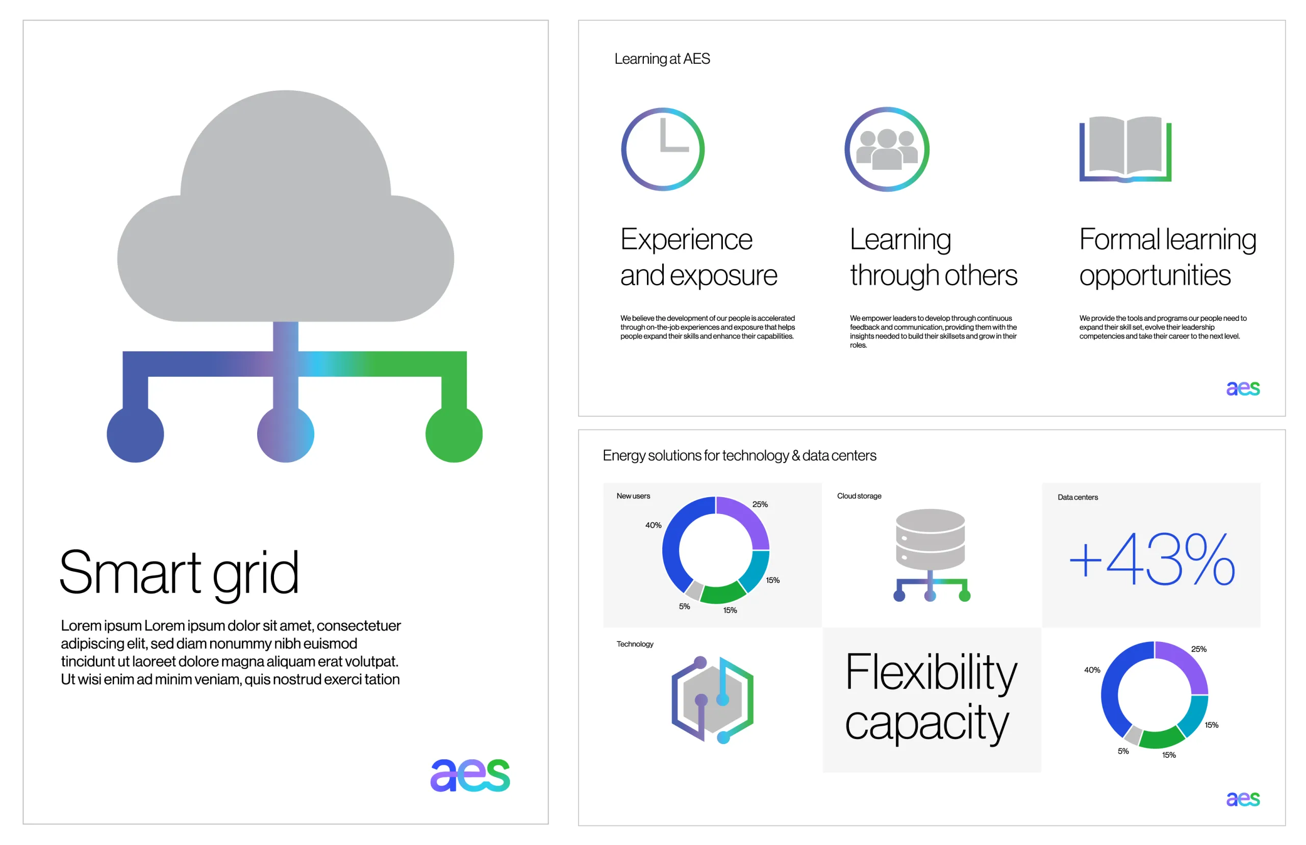
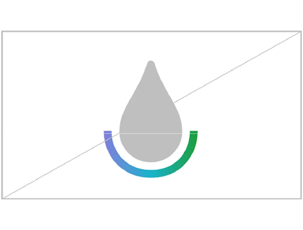
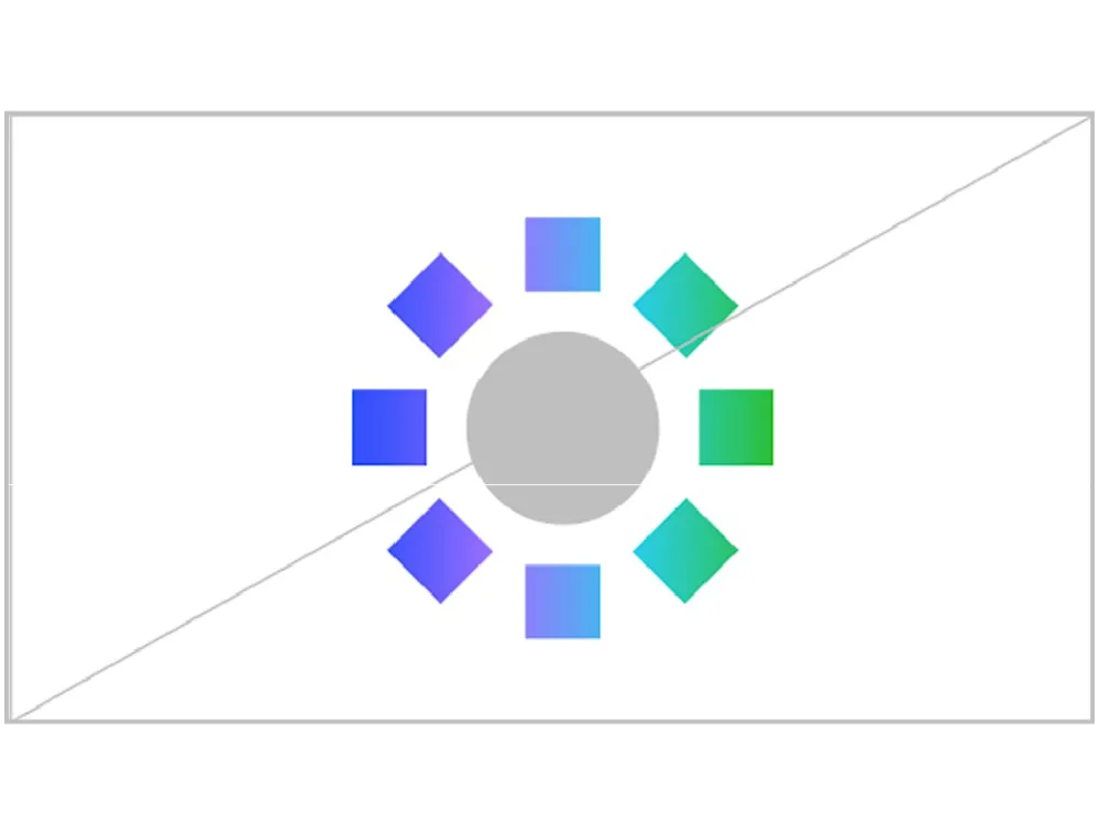
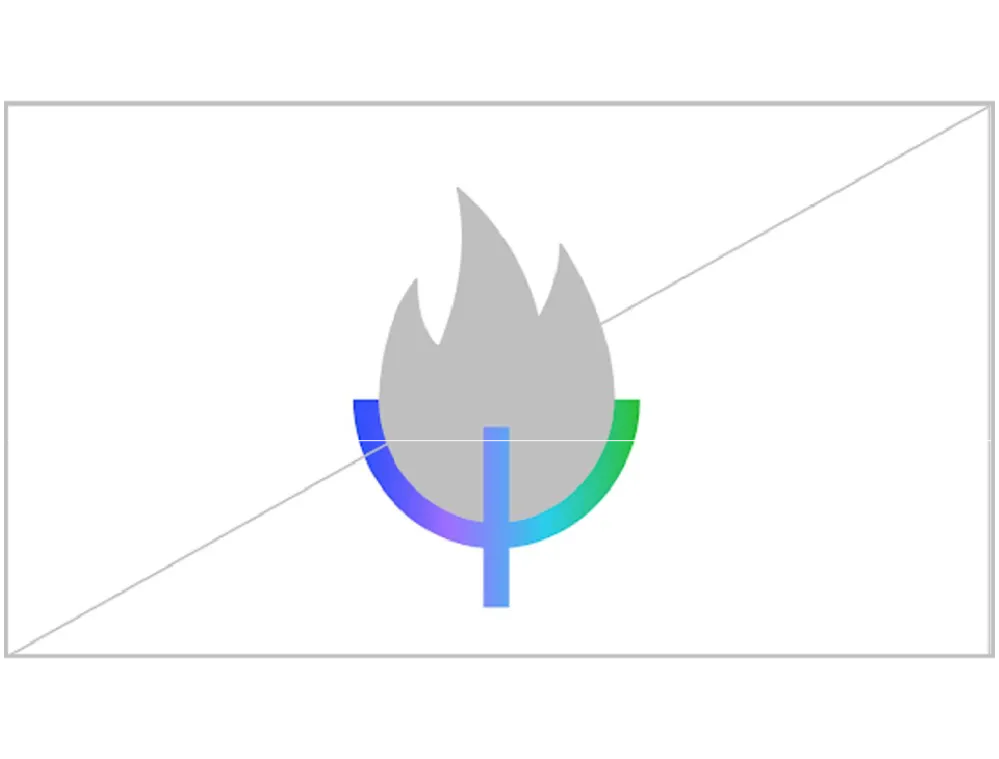
Like our logo and gestures, our iconography is built by our gradient line. Whether they’re standing alone or supporting copy, our icons are tools to dial the volume up or down on any piece of content and to reinforce our identity.

Context
Our icons are used as visual shorthands for topics we need to communicate on a regular basis. Topics may include icons to represent our values or different components of our solutions.
Icons help to structure information and create visual emphasis across both digital and printed environments. However, they shouldn’t be created to visualize potentially confusing and complex topics, as these topics will be easier to explain in copy.
Icons should be accompanied by explanatory copy to allow people to ‘learn’ their meaning. Icons should not be used purely for decorative purposes.
Ten icons have a specific meaning:
- 7 generation icons
- 3 values icons
All other icons in our library are available to use for any context (as long as you provide the explanatory copy).
Generation icons
Seven icons represent our generation types and should only be used for this purpose.
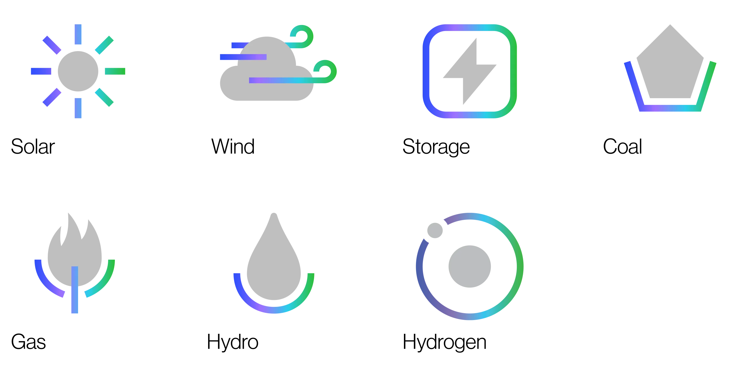
Values icons
Three icons represent our values and should only be used for this purpose.

Construction
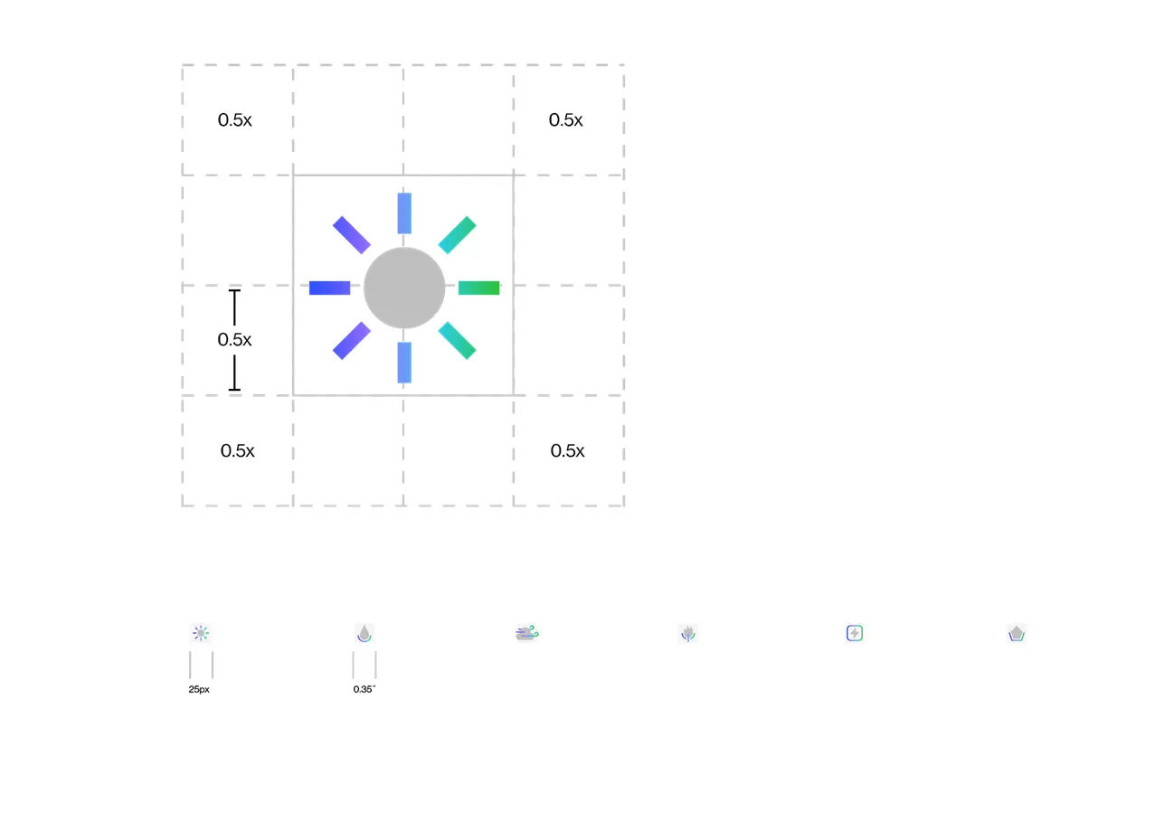
Icons are constructed on a 20 unit grid with the following aspects in mind:
Composed of two elements:
- one geometric shape;
- and one gradient line
Together, the two elements
- complete the meaning of the icon
The shape—as well as the line
- elements—need to be simple to
- allow for use at small scale
The line stroke is 5% (1 unit) of the grid. The space between the elements should be at least 5% (1 unit) of the grid. Although the gradient line can be broken, it must be masked within the same gradient.
Gradient colors are plotted evenly along the stroke at regular intervals. Refer to ‘AES gradient’ page for more details. AES Gray 03 is used for the solid shape. Refer to ‘color breakdown’ for values.
Proportions
Although our icons vary in height and width, they always have the same overall impact. They are visually connected by their consistent use of the AES gradient, line width and solid Gray 03 shape.
If stacking in a line or grid, they should be center aligned.
Clear space and minimum size
Like gestures, clearspace around icons is approximately half the height of the icon.
The minimum recommended size of the icons are 0.35 inches for print and 25px for digital.
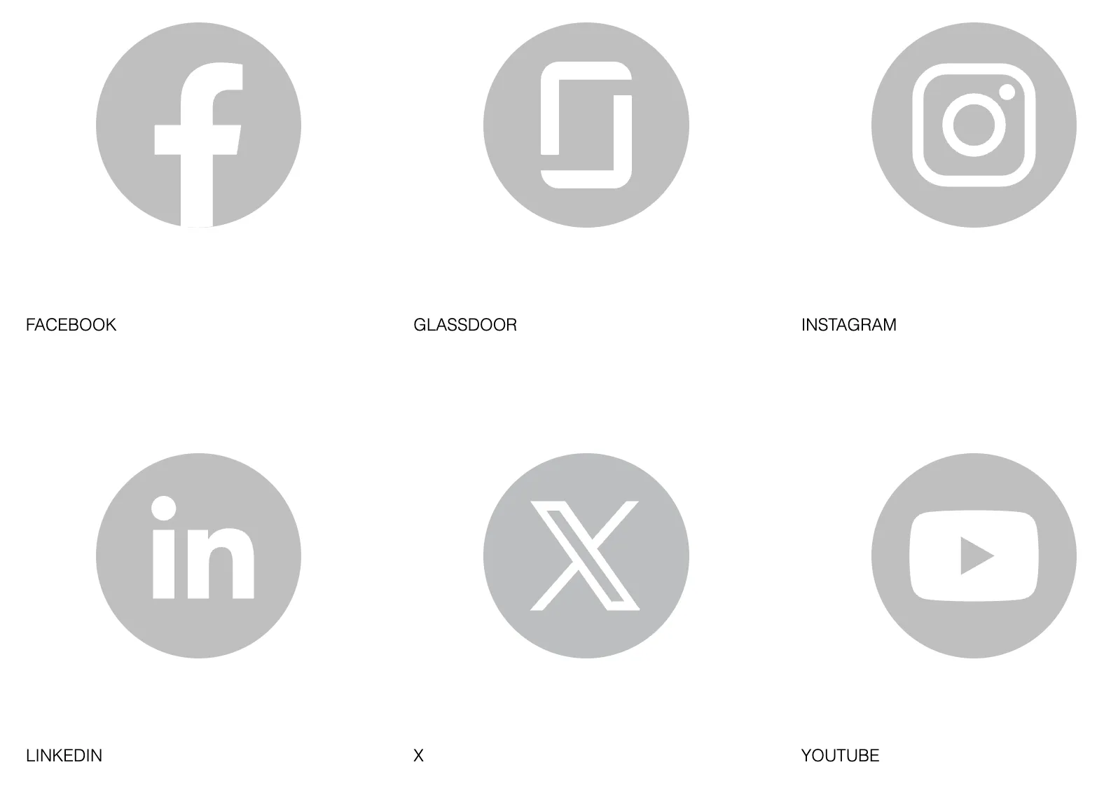
Social media
When referring to external social media outlets, use the a white logo on a Gray 03 background.
Incorrect usage
Do no edit gradient. Ensure blue is the first color on the left, and green is pointing towards the top right.
Do not add fill gradient to solid elements.
Do not add complexity to iconography or use multiple solid elements.
Always use AES Gray 03 for solid color.
Always show the full gradient swatch.
Ensure gradient stroke is the correct thickness (5% of construction grid).

Do not rotate or overlap icons. Ensure adequate clearspace between icons. Do not apply effects to icons.
Ensure white space between elements.
